People often talk about office design in terms of furniture, layout, or lighting, yet color psychology quietly shapes employee behavior in ways many decision-makers underestimate. In my own research on workplace environments, I’ve noticed that the “right” office art can influence productivity more effectively than some high-budget renovations. Paintings and wall décor aren’t merely visual fillers—they're subtle behavioral cues.
Color psychology is not a new discipline, but its application in workplace art has gained attention only in the past decade. Neuroscience suggests that color stimuli are processed faster than textual information, which means employees respond to artwork long before they consciously register it. This is one reason organizations increasingly treat wall art as a strategic tool rather than a decorative afterthought.
What makes this topic particularly interesting is that artwork introduces color in a dynamic, less rigid way. A painted canvas or abstract mural doesn’t overwhelm the space like a fully colored wall might; instead, it introduces emotion and visual rhythm. This “soft influence” is often more acceptable in professional environments, especially in commercial offices that balance brand identity with practicality.
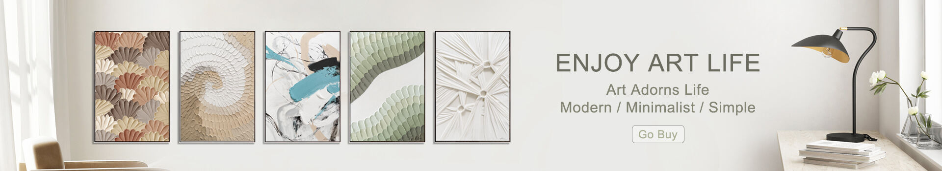
Among all hues, blue and green dominate discussions around productivity. Blue—widely used in corporate environments—supports analytical thinking and reduces mental fatigue. A well-curated set of blue-toned office art pieces, whether seascapes or geometric abstracts, can create an atmosphere that encourages steady focus.
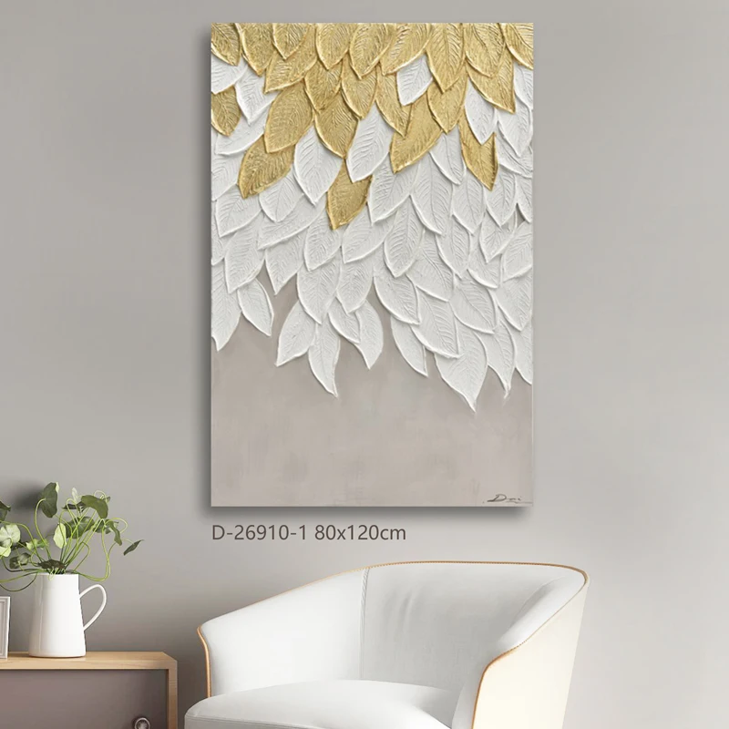
Green functions differently. It introduces visual rest. Research in environmental psychology associates green with improved concentration and longer attention spans. When integrated through botanical artwork, nature-inspired paintings, or textured green palettes, it softens the harder edges of fast-paced commercial spaces. I’ve seen companies adopt green-accented artwork intentionally near high-pressure departments like finance or operations, almost as a counterweight to cognitive overload.
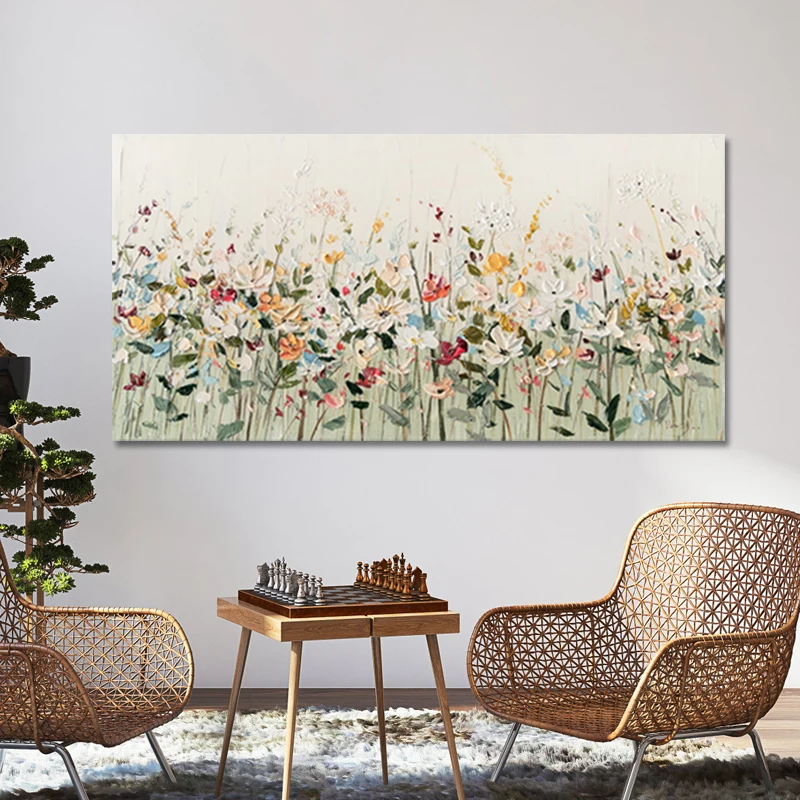
Warm hues—reds, oranges, and certain vibrant yellows—require a more tactical approach. They energize spaces, spark creativity, and can sustain group engagement. That said, these tones also intensify emotional responses. In the context of workplace artwork, brief accents tend to outperform large, dominating compositions.
An office lobby, for instance, might benefit from a bold red abstract that communicates momentum and brand vitality. But using the same artwork in a focus-heavy workspace could be counterproductive. In my own evaluations, warm-hued art works best when the goal is stimulation rather than deep concentration—innovation hubs, collaborative zones, or break areas.
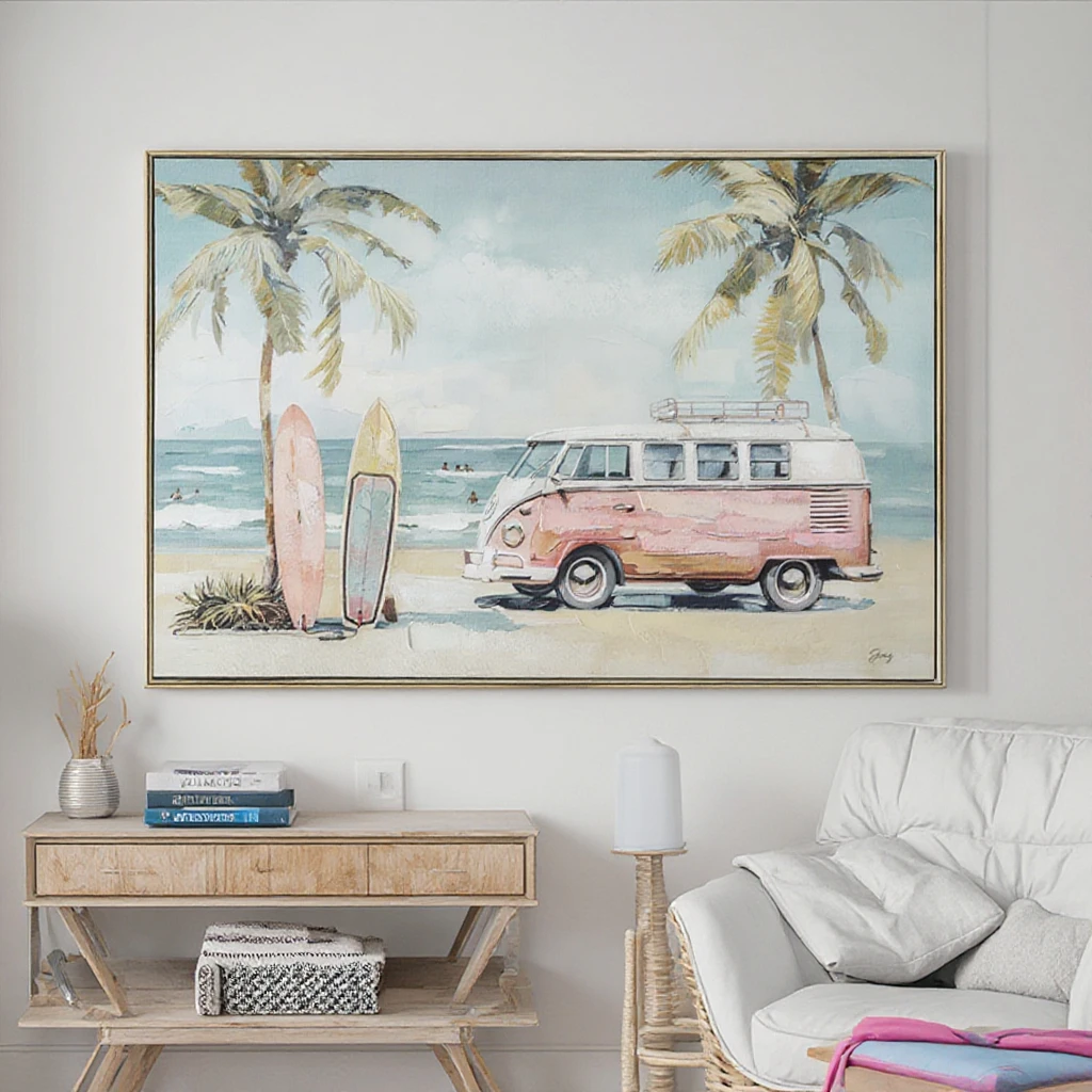
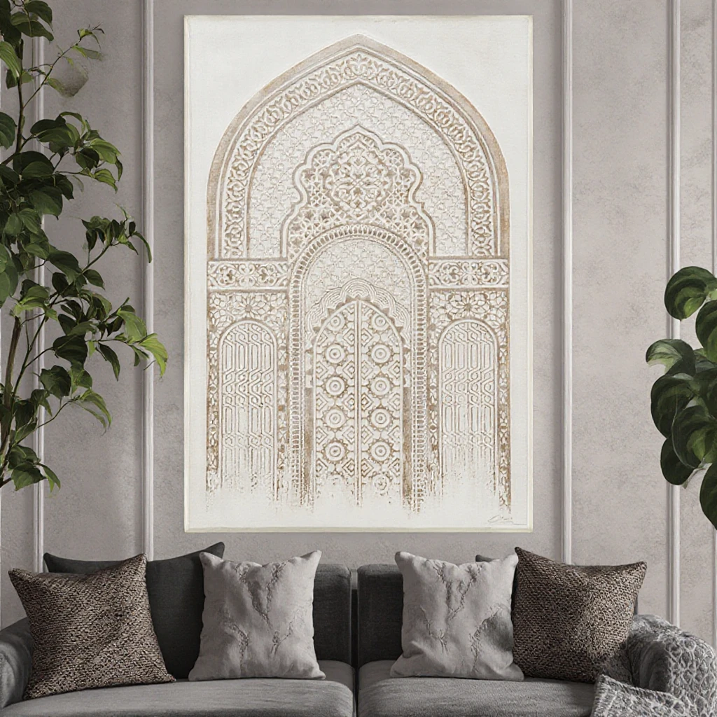
While much of color psychology centers around bright or saturated tones, neutrals deserve more scholarly attention. Beige, gray, and off-white don’t demand cognitive processing, allowing the artwork’s form and texture to take the lead. This makes them ideal for offices prioritizing clarity and minimal distraction.
Neutral-based office art is frequently selected for executive suites or consultation rooms—spaces where emotional neutrality benefits decision-making. A monochrome composition can downshift the visual complexity of an environment, reducing mental clutter and supporting more measured thinking.
One common misconception is that selecting workplace artwork is purely aesthetic. In reality, productivity-oriented art curation often involves aligning color choices with departmental goals. For example:
Sales teams may respond well to energetic artwork that sustains motivation.
Analytical departments usually benefit from cooler, focus-enhancing tones.
Creative teams often thrive in environments with mixed palettes and textured artwork.
The goal isn’t to impose color theory rigidly but to use it as a flexible interpretive framework. In many commercial interiors I’ve assessed, the most effective approach blends color psychology with brand identity, spatial lighting, and cultural context.
Color psychology is sometimes simplified into neat rules, but real workplaces rarely behave like controlled lab environments. The beauty of office art lies in its nuance: a piece doesn’t just bring color—it brings narrative, memory, and emotional pacing. When thoughtfully integrated, artwork becomes a catalyst for productivity, not merely a decorative layer.
If you're in the process of curating art for an office, consider it a conversation with the space rather than a checklist. Let color guide the tone, but let the artwork shape the story.
 Hot News
2025-10-20
2025-09-08
2025-09-01
2025-02-01
Discover Free Cloud Arts, where art is more than just visuals—it's an emotional journey. Our innovative designs and unique concepts bring something different to the world of art. Explore our collections of 100% handmade paintings, canvas prints, and layered mat glass art.
No. 2980, Zhufeng Road South, Doumen District, Zhuhai, Guangdong, China, 519170
Copyright © 2026 China Zhuhai Free Cloud Arts Co., Ltd. All rights reserved. Privacy Policy;