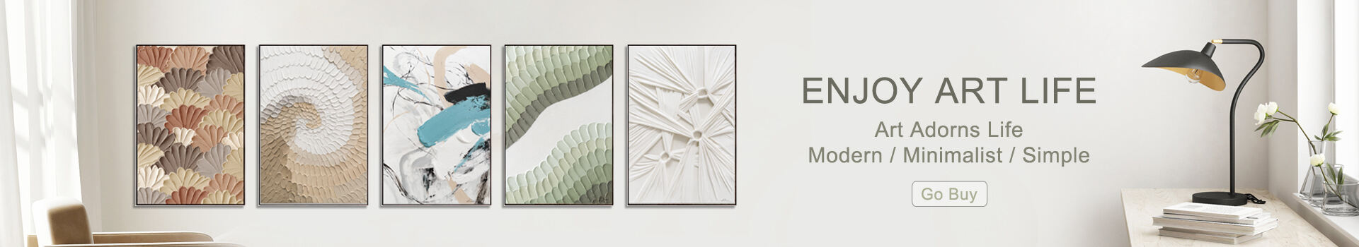
Choosing the right corporate wall art size sounds simple—measure the wall, pick a canvas, done. But anyone who has spent time analyzing commercial interiors knows that scale is one of the most common sources of visual imbalance. I’ve walked into beautifully designed offices where everything felt right—lighting, furniture, branding—until an undersized painting threw the entire space off rhythm. It’s a small detail with disproportionate influence.
In corporate environments, artwork functions as both a spatial anchor and a psychological cue. Designers often focus on color theory or thematic alignment, but wall art scale determines how the space communicates in the first place. A piece that’s too small fades into the background, while an oversized one can dominate the room in a way that feels accidental rather than intentional.
Studies in spatial perception show that humans judge room proportions unconsciously; our sense of balance is easily disrupted. This is why the “right size” isn’t merely decorative—it shapes how employees and visitors orient themselves within the office.
If I had to identify the single most widespread issue in corporate wall art, this would be it. Small art on large walls creates visual emptiness. Even a well-composed abstract loses impact when it floats alone in a sea of empty space.
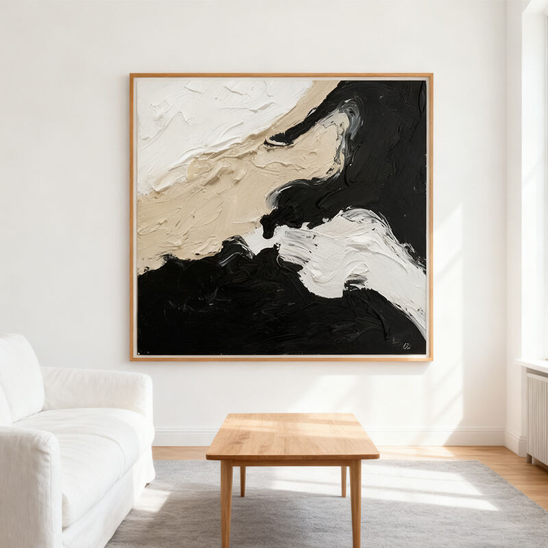
A useful rule—borrowed from spatial composition theory—is to fill about 60–75% of the available wall space. In practice, that often means choosing pieces larger than you initially think appropriate. Many offices benefit from oversized canvases or multi-panel installations, which distribute visual weight more naturally.
The relationship between artwork and furnishing deserves as much attention as the artwork itself. In reception areas, conference rooms, or executive offices, office artwork should anchor the furniture below it.
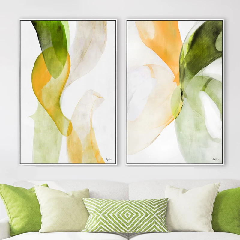
One recurring error is placing narrow artwork above a wide sofa or console. The imbalance makes the artwork look like an afterthought. Ideally, the art should span at least two-thirds of the furniture’s width. This proportion keeps the space coherent and subtly guides visual flow.
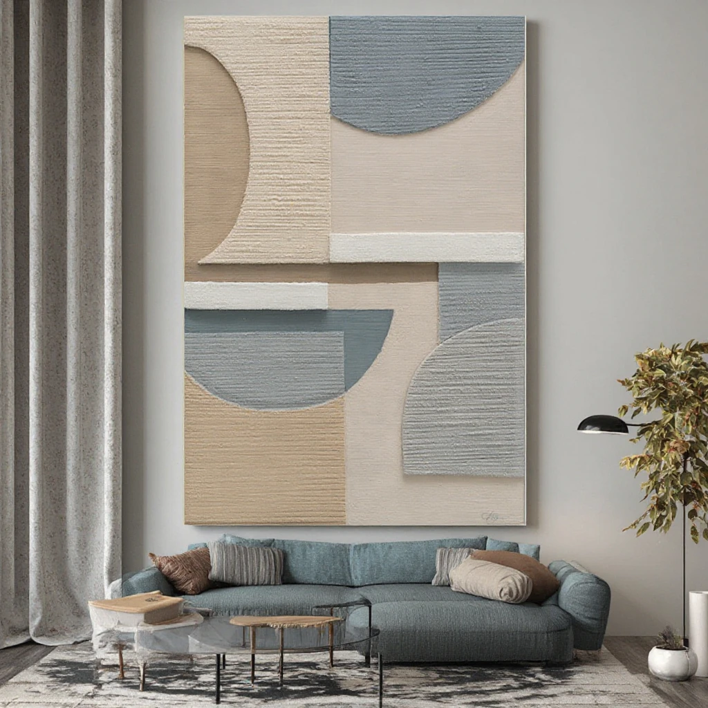
This is a surprisingly consistent issue across commercial interiors. Many facilities teams install artwork higher than eye level, perhaps assuming it should feel “grand” or “formal.” In reality, high placement disconnects the artwork from the room’s visual field.
Art should sit at average eye height—typically 145–155 cm from the floor to the center of the piece. In corporate hallways where people walk quickly, you can position it slightly lower to maintain alignment with natural sightlines.
When analyzing office layouts, I often see artwork sized correctly but chosen without considering spatial circulation. Stairwells, corridors, and collaborative zones have different movement patterns, and wall art size should adjust accordingly.
Large, immersive pieces feel appropriate in slow-traffic spaces like lounges or executive waiting rooms. Conversely, in high-traffic corridors, narrower vertical artwork performs better because it respects the pacing of movement and avoids visual clutter.
Beyond dimensions, the format—portrait, landscape, panoramic—plays a structural role. Long horizontal pieces stabilize wide conference rooms, while vertically oriented art expands narrow walls and makes architectural constraints feel intentional.
Multi-panel sets (triptychs or diptychs) offer flexibility, especially in offices with irregular wall shapes. They provide a rhythm that single canvases sometimes fail to deliver, and their modularity helps maintain visual coherence across open-plan environments.
Corporate clients sometimes hope one striking artwork will “solve” the room, but in practice, scale must be distributed. A single oversized piece can feel theatrical if the surrounding environment is visually quiet. Instead, consider gallery-style arrangements, especially in large open offices. Clustered artwork creates balance and invites the viewer into a narrative rather than a solitary focal point.
After years of observing how organizations use corporate wall art to express culture, I’ve come to believe scale is less about measurement and more about intent. Size communicates confidence, hierarchy, and the spatial priorities of the company. Small, timid artwork often signals indecision; bold sizing reads as deliberate and modern.
When chosen thoughtfully, well-scaled art doesn't just fill walls—it shapes how people inhabit the workplace. It ties together brand, emotion, and spatial behavior in a way that few other design elements can.
 Hot News
2025-10-20
2025-09-08
2025-09-01
2025-02-01
Discover Free Cloud Arts, where art is more than just visuals—it's an emotional journey. Our innovative designs and unique concepts bring something different to the world of art. Explore our collections of 100% handmade paintings, canvas prints, and layered mat glass art.
No. 2980, Zhufeng Road South, Doumen District, Zhuhai, Guangdong, China, 519170
Copyright © 2026 China Zhuhai Free Cloud Arts Co., Ltd. All rights reserved. Privacy Policy;